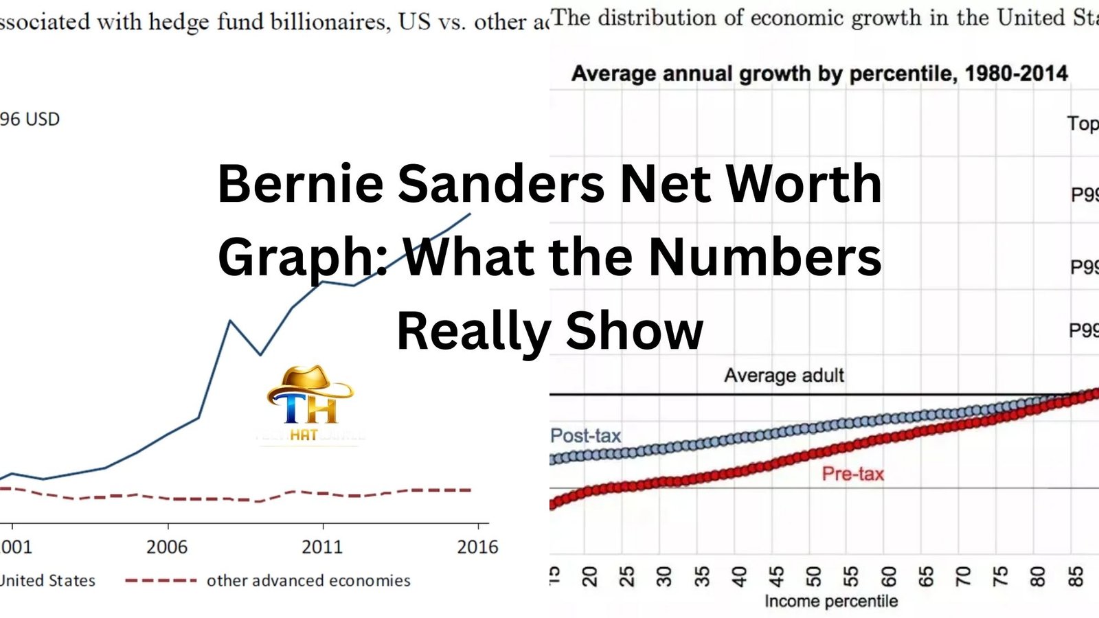
Type “Bernie Sanders net worth graph” into a search engine and you’ll notice something interesting almost immediately. The line isn’t what many people expect. It doesn’t explode upward like a tech founder’s chart or bounce wildly like a celebrity entrepreneur’s. Instead, it moves slowly… almost quietly… for decades.
And then it climbs.
That simple line has sparked years of debate. Critics point at it and say, “See? A socialist millionaire.” Supporters shrug and say, “He wrote a few best-selling books after spending a lifetime in public service.”
The truth sits somewhere between the memes and the headlines. But the graph itself tells a surprisingly human story — one about timing, publishing success, and the strange financial reality of long careers in politics.
Let’s walk through what that net worth graph actually shows.
The Long Flat Line: Decades of Modest Income
For a huge portion of Bernie Sanders’ life, the net worth graph is… honestly pretty boring.
From the 1970s through much of the 2000s, there isn’t much movement. Sanders spent those years doing what career politicians often do: earning government salaries while living relatively ordinary financial lives.
When he became mayor of Burlington, Vermont in 1981, the salary was modest. Later, as a member of the U.S. House of Representatives starting in 1991, he earned what every representative earned. No special bonuses. No corporate board seats. No consulting deals.
For context, congressional salaries during that period were typically in the $130,000–$170,000 range. Comfortable, sure. But not the kind of money that builds massive wealth unless someone is aggressively investing or running businesses on the side.
And Sanders wasn’t doing either of those things.
Financial disclosure forms from those decades show something almost unusual for a national politician: relatively limited assets. Some retirement accounts. A home in Vermont. That’s about it.
If you plotted those years on a graph, it would look like a calm lake. No spikes. No sudden wind.
That slow pace becomes important later.
The Sudden Rise Around 2016
Now the graph starts getting interesting.
Around 2016, Bernie Sanders’ net worth begins climbing quickly.
Not because of hedge funds. Not because of corporate deals.
Books.
During and after his first presidential campaign, Sanders published several titles that sold extremely well. One of the biggest was Our Revolution, released in late 2016. It became a New York Times bestseller and reportedly generated millions in royalties.
Publishing money works in bursts. A book release can suddenly deliver large royalty payments over a short period of time. When an author has national attention — like a presidential candidate does — those numbers can jump fast.
Between book royalties and speaking-related income tied to those books, Sanders and his wife Jane reportedly earned over $1 million in some years after the campaign.
That’s when the net worth graph tilts upward.
Not a vertical rocket ship. But a clear slope.
What the Graph Actually Shows Today
Most estimates place Bernie Sanders’ net worth somewhere between $2 million and $3 million.
Depending on the year and source, you’ll see slightly different numbers. That’s normal with public financial disclosures because they show ranges rather than exact figures.
But the broad shape of the graph looks something like this:
- Decades below $500,000
- Gradual climb in the early 2010s
- A noticeable jump after the 2016 presidential run
- Stabilization in the low-million range
For someone who has spent more than 40 years in public office, that’s not especially extreme.
Compare that to many other long-time politicians who accumulated wealth through law practices, consulting roles, corporate boards, or inherited assets.
Sanders’ graph looks different mainly because the rise came late.
The “Socialist Millionaire” Debate
This is where the conversation usually turns political.
Critics often point to that rising net worth graph as proof that Sanders’ economic message is hypocritical. The phrase “socialist millionaire” pops up in headlines every election cycle.
But Sanders has responded to that criticism in a pretty direct way.
His basic argument goes like this: if you write a successful book, you get paid for it.
And that’s true. Book royalties are straightforward transactions. Millions of Americans buy the book. The author receives a percentage.
Whether someone agrees with his politics or not, the income source isn’t mysterious.
Let’s be honest — if a teacher, journalist, or engineer suddenly wrote a bestseller and earned a few million dollars, most people wouldn’t consider that controversial. It would just look like success arriving later in life.
The controversy mostly exists because Sanders talks about wealth inequality while being financially comfortable himself.
Politics tends to amplify those contradictions.
Real Estate on the Graph
Another piece of the net worth puzzle is property.
Bernie and Jane Sanders own three homes:
- Their primary residence in Burlington, Vermont
- A townhouse in Washington, D.C.
- A lakefront vacation home in Vermont
The vacation property, purchased in 2016, drew a lot of media attention at the time. Not because it was extravagant — it’s relatively modest by luxury standards — but because the purchase happened right when his financial profile was rising.
Real estate naturally affects net worth graphs. Property values rise over time, which can slowly increase total wealth even if income stays the same.
So part of that upward slope isn’t just book money. It’s housing appreciation.
Anyone who’s owned a home for a few decades has probably seen something similar on a personal finance chart.
Why the Graph Looks So Different From Other Politicians
If you compared Sanders’ net worth graph to someone like Mitt Romney or Donald Trump, the contrast would be dramatic.
Romney’s wealth came from private equity. Trump’s came from real estate development. Their graphs started high and grew faster.
Sanders’ financial life followed a different track entirely: public salary first, personal wealth later.
In a way, the graph reflects a broader shift in American politics. Campaigns today generate enormous public attention. That attention can translate into media deals, books, podcasts, speaking tours — a whole mini-economy that didn’t exist at the same scale decades ago.
Someone who becomes a national political figure today often sees their income options expand overnight.
The Sanders graph is a perfect example of that phenomenon.
A Small Example of How Book Money Changes Everything
Imagine a professor who earns $120,000 a year for 30 years.
Solid career. Comfortable middle-class life. Savings grow slowly.
Then one year the professor writes a book that sells a million copies.
If royalties average even $3 per book, that’s $3 million before taxes.
Suddenly the financial graph spikes.
That doesn’t erase the previous decades of modest income. It just compresses wealth accumulation into a short window.
Sanders’ graph works almost exactly like that.
What People Often Miss When Looking at Net Worth Charts
Net worth graphs look clean and simple. But they hide a lot of nuance.
For example:
Assets aren’t cash. A house valued at $800,000 doesn’t mean someone has $800,000 sitting in the bank.
Disclosure forms use ranges, which makes precise totals tricky.
And income timing matters a lot. A single successful project — like a book — can distort the overall picture.
So when people debate Sanders’ wealth using a simple line graph, they’re often compressing decades of financial history into a single talking point.
Graphs are powerful visuals. Sometimes a little too powerful.
The Timing Is the Most Interesting Part
The thing that makes the Bernie Sanders net worth graph unusual isn’t the size of the wealth.
It’s when the wealth appears.
Most high-profile figures accumulate money early or mid-career. Sanders’ financial jump happens in his seventies.
That’s rare.
It’s also oddly relatable. Many people spend decades building stable but modest finances before hitting a surprising opportunity later in life — a business success, a property boom, an inheritance, a bestselling book.
Life doesn’t always produce smooth financial curves.
Sometimes it produces long quiet lines followed by a sudden turn upward.
The Takeaway from the Graph
The Bernie Sanders net worth graph isn’t really a story about huge wealth.
It’s a story about timing, public visibility, and how modern political fame can spill into publishing success.
For most of his career, Sanders lived on government salaries that kept his finances fairly ordinary. Then, after becoming one of the most recognizable political figures in the country, book royalties and property gains nudged his net worth into the millionaire range.
That’s the whole curve.
No dramatic billionaire climb. No secret financial empire. Just a slow line that bends upward late in the game.